

A VisualElement has style properties that can either be set directly in C# (as we’ve seen earlier) or applied from a stylesheet. In addition to layout properties, there also exist several properties affecting the way an element is drawn on screen, such as backgroundImage or borderColor.Style sheets are supported in Unity via the USS file format.Note: For a certain ease of use, we will only use a single stylesheet for the entire window. However, you can use as many stylesheets as you want!On your desktop, create a new text file and name it “QuickTool_Style.uss”. Then, drag it inside Unity and drop it inside Assets > Editor > Resources.You associate a stylesheet to a VisualElement via the VisualElement.styleSheets.Add() method:
private void OnEnable()
{
    // Reference to the root of the window.
    var root = rootVisualElement;

    // Associates a stylesheet to our root. Thanks to inheritance, all root’s
    // children will have access to it.
    root.styleSheets.Add(Resources.Load<StyleSheet>("QuickTool_Style"));

    // Loads and clones our VisualTree (eg. our UXML structure) inside the root.
    var quickToolVisualTree = Resources.Load<VisualTreeAsset>("QuickTool_Main");
    quickToolVisualTree.CloneTree(root);

    // Queries all the buttons (via type) in our root and passes them
    // in the SetupButton method.
    var toolButtons = root.Query<Button>();
    toolButtons.ForEach(SetupButton);
}
Notes:
- Stylesheets modified while used in a running Editor window take effect immediately (meaning, no reload time) and should re-style your UI accordingly;
- Stylesheets can be attached to any VisualElement and thus their rules apply to all descendants of this container.
Open your USS file. There, you can declare multiple selectors. Mainly:
- Starting with “.” will match on class (elements that are given a specific class will adopt said class’ properties);
- Starting with “#” will match on a VisualElement’s name (which may not be unique);
- Simply typing a word will match on type (eg. Button) that corresponds to a C# type.
We will only use classes for this example. First, let’s create the style rule (using class selectors) corresponding to the buttons container:
.buttons-container {
    /* Populates the elements in this container horizontally. */
    flex-direction: row;
    /* Makes the content of the container wrap when resized. */
    flex-wrap: wrap;
}
Note: Here, you are only setting Flex properties. It’s at the core of any UIElements layout and understanding their workflows is mandatory. To learn more about Flex properties, click here.Finally, let’s create the style rules (using class selectors) for the buttons and icons:
.quicktool-button {
width: 50px;
height: 50px;
/* Style rule that aligns items on the horizontal axis. */
align-items: flex-start;
/* Style rule that aligns items on the vertical axis. */
justify-content: center;
}
.quicktool-button-icon {
height: 40px;
width: 40px;
opacity: 0.8;
}
/* How the icon should behave when hovered. */
.quicktool-button-icon:hover {
opacity: 1;
}
/* How the icon should behave when its parent button is clicked. */
.quicktool-button:active > .quicktool-button-icon {
opacity: 0.6;
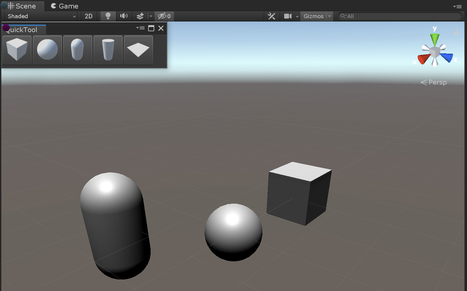
}Note: Any styling done directly in a C# script will override the same styling from a USS file. Example: if your USS file sets a margin-top: 5 and your C# sets a VisualElement.style.marginTop = 2, your element will have a VisualElement.style.marginTop = 2.Save your file and go back to Unity.Your custom Editor window is now done! You should have a small horizontal toolbar, and clicking on a button should instantiate what it’s representing directly in your Scene. Finally, every object creation should be undoable/redoable.